" height="29.72699595050568px" id="PsCA3PACX" transform="translate(47.789 22.273)" width="118.21136286703586px"/><path d="M 14.421 3.979 C 14.61 4.174 14.61 4.483 14.421 4.678 C 13.802 5.285 13.12 5.824 12.385 6.286 C 11.591 6.834 10.744 7.302 9.858 7.684 C 8.981 8.102 8.063 8.43 7.12 8.663 C 6.246 8.878 5.351 8.995 4.452 9.012 C 4.099 9.024 3.747 9.001 3.399 8.943 C 2.726 8.883 2.077 8.667 1.503 8.313 C 0.936 7.958 0.456 7.48 0.099 6.915 C 0.042 6.808 0.018 6.686 0.029 6.566 C 0.056 6.428 0.13 6.304 0.24 6.216 C 0.372 6.159 0.517 6.135 0.661 6.146 C 0.799 6.173 0.923 6.247 1.012 6.356 C 1.3 6.751 1.687 7.065 2.135 7.265 C 2.575 7.464 3.056 7.56 3.539 7.544 C 4.037 7.536 4.523 7.39 4.943 7.125 C 5.223 6.998 5.411 6.731 5.435 6.426 C 5.518 6.129 5.438 5.81 5.224 5.587 C 4.999 5.34 4.739 5.128 4.452 4.958 C 3.881 4.611 3.381 4.161 2.978 3.629 C 2.907 3.559 2.837 3.49 2.767 3.49 C 2.697 3.49 2.556 3.49 2.486 3.559 L 0.935 4.993 C 0.789 5.142 0.572 5.196 0.373 5.132 C 0.172 5.09 0.027 4.917 0.022 4.713 C -0.034 4.515 0.019 4.302 0.162 4.154 L 3.322 1.217 C 3.685 0.809 4.084 0.435 4.515 0.099 C 4.655 0.029 4.726 -0.041 4.866 0.029 C 5.014 0.026 5.15 0.108 5.217 0.239 C 5.287 0.379 5.357 0.448 5.357 0.588 C 5.355 0.718 5.305 0.842 5.217 0.938 L 4.094 1.986 C 3.901 2.167 3.799 2.423 3.813 2.686 C 3.825 2.975 3.984 3.238 4.234 3.385 L 5.077 4.014 C 5.481 4.278 5.858 4.582 6.2 4.923 C 6.412 5.265 6.555 5.645 6.621 6.041 C 6.66 6.427 6.587 6.815 6.411 7.16 C 6.34 7.3 6.34 7.37 6.411 7.439 C 6.481 7.509 6.551 7.579 6.691 7.509 C 9.363 6.896 11.815 5.566 13.782 3.664 C 13.852 3.524 13.993 3.524 14.133 3.524 C 14.097 3.727 14.221 3.924 14.421 3.979 Z" fill="rgb(245, 239, 255)" height="9.01530318276759px" id="EQoki64Hs" transform="translate(51.017 10.003)" width="14.562725306966438px"/><path d="M 18.837 0.372 C 18.977 0.442 18.977 0.582 18.977 0.722 C 18.963 0.87 18.915 1.014 18.837 1.141 C 18.253 1.752 17.619 2.313 16.941 2.819 C 16.169 3.378 15.327 3.938 14.414 4.497 C 13.558 5.03 12.638 5.453 11.676 5.755 C 10.824 6.08 9.92 6.246 9.008 6.245 L 8.938 6.245 C 7.788 6.327 6.667 5.86 5.919 4.986 C 5.572 4.622 5.351 4.156 5.287 3.658 C 5.287 3.448 5.147 3.378 4.936 3.308 C 4.759 3.244 4.561 3.301 4.445 3.448 C 4.034 3.88 3.588 4.278 3.111 4.637 C 2.714 4.95 2.261 5.187 1.777 5.336 C 1.378 5.47 0.94 5.418 0.584 5.196 C 0.237 5.025 0.019 4.672 0.022 4.287 C -0.033 3.816 0.015 3.339 0.162 2.889 C 0.319 2.388 0.506 1.898 0.724 1.421 C 0.935 0.931 1.145 0.582 1.286 0.232 C 1.353 0.101 1.489 0.02 1.637 0.023 C 1.78 -0.024 1.937 0.002 2.058 0.092 C 2.189 0.159 2.271 0.295 2.269 0.442 C 2.338 0.573 2.338 0.73 2.269 0.861 C 1.932 1.391 1.65 1.953 1.426 2.539 C 1.23 2.933 1.11 3.36 1.075 3.798 C 1.005 4.147 1.075 4.357 1.145 4.357 C 1.356 4.497 1.566 4.427 1.918 4.217 C 2.352 3.965 2.753 3.66 3.111 3.308 C 3.532 2.889 4.024 2.399 4.445 1.91 L 5.709 0.232 C 5.762 0.121 5.867 0.042 5.989 0.023 C 6.133 0.012 6.278 0.036 6.411 0.092 C 6.536 0.147 6.636 0.247 6.691 0.372 C 6.762 0.478 6.762 0.616 6.691 0.722 C 6.603 0.973 6.533 1.23 6.481 1.491 L 6.27 2.539 C 6.2 2.885 6.2 3.242 6.27 3.588 C 6.3 3.896 6.422 4.189 6.621 4.427 C 7.206 5.035 8.023 5.366 8.868 5.336 L 8.938 5.336 C 9.781 5.329 10.615 5.163 11.395 4.846 C 12.264 4.508 13.108 4.111 13.923 3.658 C 14.733 3.179 15.508 2.642 16.239 2.05 C 16.853 1.57 17.439 1.057 17.994 0.512 C 18.111 0.402 18.257 0.328 18.416 0.302 C 18.559 0.256 18.716 0.282 18.837 0.372 Z" fill="rgb(245, 239, 255)" height="6.253976753204001px" id="oQBxKjX7U" transform="translate(63.633 13.505)" width="18.97736485676348px"/><path d="M 16.432 12.421 C 16.52 12.544 16.569 12.69 16.573 12.841 C 16.575 12.988 16.494 13.124 16.362 13.19 C 15.665 13.859 14.858 14.403 13.975 14.798 C 13.154 15.15 12.271 15.34 11.377 15.358 C 10.483 15.395 9.587 15.325 8.71 15.148 C 7.844 14.976 6.997 14.718 6.182 14.379 C 5.978 14.309 5.755 14.309 5.55 14.379 C 5.342 14.47 5.187 14.65 5.129 14.868 C 5.015 15.338 4.826 15.787 4.568 16.197 C 4.354 16.677 3.983 17.072 3.515 17.315 C 3.069 17.591 2.563 17.759 2.04 17.805 C 1.85 17.816 1.66 17.792 1.479 17.735 L 1.268 17.665 C 0.074 17.036 -0.277 15.358 0.215 12.561 C 0.355 11.792 0.566 11.023 0.777 10.114 C 0.987 9.206 1.338 8.297 1.689 7.388 C 2.04 6.479 2.391 5.57 2.812 4.731 C 3.234 3.892 3.655 3.123 4.076 2.424 C 4.428 1.816 4.852 1.253 5.34 0.746 C 5.628 0.365 6.058 0.113 6.533 0.047 C 6.813 -0.035 7.113 -0.01 7.376 0.117 C 7.631 0.246 7.849 0.439 8.008 0.677 C 8.145 1.13 8.169 1.61 8.078 2.075 C 7.933 2.747 7.721 3.402 7.446 4.032 C 7.165 4.731 6.814 5.5 6.393 6.339 C 5.972 7.108 5.55 7.947 5.059 8.716 C 4.568 9.485 4.076 10.254 3.655 10.953 C 3.234 11.652 2.742 12.212 2.321 12.701 C 1.9 13.19 1.619 13.54 1.338 13.82 L 1.268 13.89 C 1.198 14.493 1.198 15.103 1.268 15.707 C 1.304 16.121 1.578 16.476 1.97 16.616 C 2.365 16.784 2.819 16.731 3.163 16.476 C 3.391 16.259 3.603 16.026 3.795 15.777 C 4.043 15.313 4.232 14.82 4.357 14.309 C 4.407 13.895 4.216 13.489 3.866 13.26 C 3.666 13.138 3.478 12.997 3.304 12.841 C 3.165 12.716 3.088 12.537 3.093 12.352 C 3.099 12.148 3.244 11.974 3.444 11.932 C 3.707 11.805 4.007 11.78 4.287 11.862 C 4.582 11.914 4.839 12.094 4.989 12.352 C 5.11 12.523 5.205 12.711 5.27 12.911 C 6.05 13.344 6.874 13.695 7.727 13.959 C 8.61 14.257 9.533 14.422 10.465 14.449 C 11.415 14.506 12.367 14.387 13.273 14.099 C 14.217 13.819 15.067 13.287 15.73 12.561 C 15.853 12.473 16 12.425 16.151 12.421 C 16.151 12.282 16.292 12.282 16.432 12.421 Z M 6.604 1.026 C 6.393 1.026 6.112 1.236 5.761 1.655 C 5.347 2.147 4.993 2.687 4.708 3.263 C 4.292 3.987 3.917 4.734 3.585 5.5 C 3.234 6.339 2.812 7.248 2.461 8.157 C 2.117 9.069 1.835 10.003 1.619 10.953 C 1.61 11.03 1.635 11.107 1.689 11.163 C 1.759 11.233 1.83 11.163 1.9 11.093 C 2.883 9.695 3.795 8.297 4.638 6.829 C 5.209 5.832 5.725 4.805 6.182 3.753 C 6.468 3.151 6.68 2.517 6.814 1.865 C 6.889 1.59 6.889 1.301 6.814 1.026 Z" fill="rgb(245, 239, 255)" height="17.807318569115726px" id="irlArdnTf" transform="translate(80.837 2.085)" width="16.572724859861967px"/><path d="M 18.216 3.932 C 18.286 4.072 18.356 4.142 18.356 4.282 C 18.341 4.431 18.293 4.574 18.216 4.701 C 17.5 5.405 16.698 6.016 15.829 6.519 C 14.957 7.022 14.04 7.443 13.091 7.778 C 12.206 8.108 11.288 8.343 10.353 8.477 C 9.563 8.607 8.765 8.677 7.966 8.686 C 7.194 8.724 6.424 8.581 5.719 8.267 C 5.315 8.059 4.975 7.744 4.736 7.358 C 4.599 7.025 4.527 6.669 4.526 6.309 C 4.562 5.954 4.632 5.603 4.736 5.261 C 4.848 4.968 4.989 4.687 5.157 4.422 C 5.157 4.352 5.157 4.352 5.087 4.282 C 4.989 4.279 4.892 4.303 4.806 4.352 C 4.051 4.75 3.203 4.943 2.349 4.911 C 1.965 4.909 1.585 4.838 1.226 4.701 C 1.082 4.748 0.925 4.722 0.805 4.632 C 0.594 4.492 0.454 4.352 0.524 4.072 C 0.329 3.823 0.185 3.538 0.103 3.233 C -0.049 2.694 -0.032 2.12 0.152 1.59 C 0.33 1.055 0.674 0.59 1.135 0.262 C 1.696 -0.087 2.188 -0.087 2.468 0.262 C 2.539 0.332 2.539 0.402 2.609 0.472 C 2.665 0.632 2.712 0.796 2.749 0.961 C 2.758 1.27 2.71 1.578 2.609 1.87 C 2.45 2.393 2.263 2.906 2.047 3.408 C 2.044 3.506 2.069 3.603 2.117 3.688 C 2.188 3.828 2.258 3.898 2.328 3.898 C 3.12 3.895 3.897 3.678 4.575 3.268 C 4.796 3.145 5.032 3.051 5.277 2.989 C 5.575 2.922 5.887 3 6.119 3.198 C 6.383 3.39 6.496 3.727 6.4 4.037 C 6.326 4.355 6.208 4.661 6.049 4.946 C 5.756 5.409 5.587 5.938 5.558 6.484 C 5.59 6.915 5.861 7.292 6.26 7.463 C 6.686 7.627 7.137 7.721 7.593 7.743 C 8.322 7.759 9.05 7.712 9.77 7.603 C 10.649 7.451 11.517 7.241 12.367 6.974 C 13.299 6.679 14.194 6.28 15.035 5.785 C 15.914 5.324 16.718 4.735 17.422 4.037 C 17.539 3.938 17.69 3.888 17.843 3.898 C 17.961 3.825 18.113 3.839 18.216 3.932 Z M 1.085 2.814 C 1.315 2.293 1.502 1.756 1.647 1.206 C 1.161 1.587 0.942 2.215 1.085 2.814 Z" fill="rgb(245, 239, 255)" height="8.692323751348306px" id="QhhzsouWB" transform="translate(96.029 10.294)" width="18.35591667131144px"/><path d="M 18.447 2.543 C 18.535 2.665 18.584 2.812 18.587 2.962 C 18.591 3.112 18.505 3.248 18.37 3.312 C 18.179 3.499 17.967 3.664 17.738 3.801 C 17.387 4.081 16.903 4.431 16.264 4.85 C 15.631 5.317 14.951 5.715 14.235 6.038 C 13.483 6.444 12.68 6.75 11.848 6.947 C 11.026 7.178 10.173 7.273 9.32 7.227 C 8.467 7.148 7.647 6.86 6.933 6.388 C 6.366 6.033 5.886 5.555 5.529 4.99 C 5.424 4.819 5.239 4.714 5.038 4.71 C 4.869 4.687 4.704 4.771 4.624 4.92 C 4.331 5.367 4 5.788 3.634 6.178 C 3.312 6.558 2.936 6.888 2.517 7.157 C 2.193 7.356 1.837 7.498 1.464 7.577 C 1.215 7.573 0.972 7.501 0.762 7.367 C 0.561 7.217 0.394 7.026 0.271 6.807 C -0.154 5.831 -0.075 4.71 0.482 3.801 C 0.906 2.865 1.557 2.048 2.377 1.424 C 3.196 0.754 4.156 0.277 5.185 0.026 C 5.362 -0.038 5.561 0.018 5.677 0.166 C 5.826 0.311 5.878 0.529 5.81 0.725 C 5.768 0.925 5.594 1.07 5.389 1.075 C 4.544 1.276 3.754 1.657 3.072 2.193 C 2.402 2.754 1.853 3.443 1.457 4.221 C 1.04 4.815 0.96 5.582 1.247 6.248 C 1.317 6.388 1.387 6.458 1.457 6.458 C 1.598 6.528 1.738 6.458 2.019 6.178 C 2.3 5.899 2.51 5.549 2.861 5.13 C 3.207 4.642 3.512 4.128 3.774 3.592 C 4.055 3.032 4.336 2.473 4.617 1.984 C 4.687 1.704 4.897 1.634 5.178 1.704 C 5.43 1.746 5.628 1.942 5.67 2.193 C 5.678 2.335 5.701 2.476 5.74 2.613 C 5.811 2.922 5.905 3.226 6.021 3.522 C 6.18 3.908 6.367 4.282 6.582 4.64 C 6.812 5.01 7.124 5.321 7.495 5.549 C 8.109 5.945 8.81 6.185 9.538 6.248 C 10.299 6.264 11.058 6.146 11.778 5.899 C 12.514 5.681 13.221 5.376 13.884 4.99 C 14.512 4.65 15.121 4.277 15.709 3.871 C 16.165 3.593 16.589 3.264 16.973 2.893 C 17.324 2.613 17.464 2.473 17.464 2.473 C 17.56 2.385 17.685 2.336 17.815 2.333 C 18.243 2.368 18.384 2.438 18.447 2.543 Z" fill="rgb(245, 239, 255)" height="7.5765036423576095px" id="FtOdynwUu" transform="translate(112.135 12.138)" width="18.58751274859737px"/><path d="M 20.57 13.353 C 20.658 13.449 20.708 13.573 20.711 13.703 C 20.696 13.852 20.648 13.995 20.57 14.122 C 20.5 14.192 20.359 14.332 19.938 14.682 C 19.498 15.109 19.029 15.506 18.534 15.87 C 17.89 16.385 17.21 16.852 16.498 17.268 C 15.756 17.719 14.981 18.117 14.181 18.457 C 13.395 18.753 12.565 18.919 11.724 18.946 C 9.639 19.008 7.795 17.609 7.301 15.591 C 6.664 13.63 6.449 11.557 6.669 9.508 C 6.652 9.403 6.603 9.306 6.529 9.229 C 6.447 9.173 6.347 9.148 6.248 9.159 C 5.195 9.229 4.283 9.299 3.44 9.369 C 2.598 9.438 1.896 9.508 1.404 9.508 C 1.122 9.511 0.84 9.535 0.562 9.578 C 0.407 9.598 0.252 9.546 0.14 9.438 C 0 9.369 0 9.229 0 9.089 C 0.015 8.94 0.063 8.797 0.14 8.669 C 0.211 8.53 0.351 8.53 0.491 8.53 C 0.773 8.522 1.055 8.498 1.334 8.46 C 1.896 8.39 2.598 8.39 3.44 8.32 L 6.389 8.11 C 6.529 8.11 6.599 8.04 6.669 7.9 C 6.758 7.778 6.807 7.632 6.81 7.481 C 6.95 6.642 7.091 5.873 7.301 5.034 C 7.493 4.23 7.728 3.437 8.003 2.657 C 8.236 2.018 8.542 1.408 8.916 0.839 C 9.15 0.439 9.525 0.14 9.969 0.001 C 10.182 -0.004 10.394 0.02 10.601 0.07 C 10.882 0.14 11.092 0.42 11.303 0.839 C 11.483 1.309 11.507 1.823 11.373 2.308 C 11.297 3.093 11.132 3.866 10.882 4.615 C 10.601 5.454 10.32 6.432 10.039 7.341 C 9.969 7.551 9.969 7.621 10.039 7.691 C 10.076 7.731 10.126 7.756 10.18 7.761 L 13.971 7.551 C 15.164 7.481 16.147 7.481 16.99 7.481 C 17.12 7.483 17.245 7.533 17.341 7.621 C 17.411 7.761 17.481 7.831 17.481 7.97 C 17.467 8.119 17.419 8.262 17.341 8.39 C 17.27 8.53 17.13 8.53 16.99 8.53 C 16.147 8.53 15.094 8.53 13.83 8.6 L 9.829 8.809 C 9.688 8.809 9.618 8.809 9.548 8.879 C 9.478 8.949 9.478 8.949 9.407 9.089 C 9.127 9.928 8.846 10.697 8.565 11.466 C 8.284 12.235 8.074 12.794 7.863 13.214 C 7.929 13.834 8.07 14.445 8.284 15.031 C 8.494 15.601 8.777 16.142 9.127 16.639 C 9.456 17.098 9.923 17.441 10.461 17.618 C 11.093 17.829 11.764 17.901 12.426 17.828 C 13.146 17.683 13.851 17.472 14.532 17.198 C 15.211 16.867 15.867 16.494 16.498 16.08 C 17.085 15.694 17.647 15.274 18.183 14.822 C 18.675 14.402 19.096 14.053 19.377 13.773 C 19.657 13.493 19.798 13.353 19.868 13.353 C 19.964 13.266 20.089 13.216 20.219 13.214 C 20.289 13.144 20.43 13.249 20.57 13.353 Z M 7.933 7.411 L 7.933 7.691 C 7.933 7.831 8.003 7.831 8.074 7.831 L 8.425 7.831 C 8.52 7.837 8.612 7.802 8.68 7.735 C 8.747 7.668 8.782 7.575 8.776 7.481 C 9.127 6.432 9.407 5.523 9.688 4.615 C 9.969 3.706 10.11 3.007 10.25 2.447 C 10.373 2.087 10.397 1.701 10.32 1.329 C 10.314 1.254 10.254 1.196 10.18 1.189 C 10.103 1.18 10.025 1.205 9.969 1.259 C 9.686 1.612 9.471 2.015 9.337 2.447 C 9.062 3.156 8.828 3.88 8.635 4.615 C 8.302 5.519 8.067 6.457 7.933 7.411 Z M 7.723 10.627 C 7.793 10.627 7.863 10.557 7.933 10.417 C 8.015 10.235 8.085 10.048 8.144 9.858 C 8.215 9.679 8.263 9.49 8.284 9.299 C 8.323 9.185 8.323 9.062 8.284 8.949 C 8.098 8.867 7.882 8.894 7.723 9.019 C 7.652 9.089 7.652 9.159 7.582 9.369 C 7.512 9.578 7.512 9.718 7.512 9.928 L 7.512 10.452 C 7.652 10.557 7.652 10.627 7.694 10.627 Z" fill="rgb(245, 239, 255)" height="18.94825266915969px" id="V21xRgMpM" transform="translate(123.589 0.734)" width="20.71051583866307px"/><path d="M 160.342 14.681 C 160.43 14.804 160.479 14.95 160.482 15.101 C 160.485 15.248 160.403 15.383 160.271 15.45 C 160.079 15.635 159.867 15.8 159.639 15.94 C 159.288 16.219 158.797 16.569 158.165 16.988 C 157.531 17.455 156.848 17.854 156.129 18.177 C 155.377 18.582 154.574 18.887 153.742 19.086 C 152.921 19.316 152.067 19.411 151.215 19.365 C 150.362 19.288 149.541 18.999 148.828 18.526 C 148.26 18.171 147.78 17.693 147.424 17.128 C 147.319 16.958 147.133 16.852 146.932 16.848 C 146.762 16.826 146.595 16.909 146.511 17.058 C 146.223 17.507 145.894 17.928 145.528 18.317 C 145.206 18.698 144.827 19.028 144.405 19.295 C 144.081 19.494 143.725 19.636 143.352 19.715 C 143.103 19.71 142.86 19.638 142.65 19.505 C 142.45 19.353 142.283 19.163 142.158 18.946 C 141.733 17.969 141.812 16.848 142.369 15.94 C 142.794 15.003 143.445 14.187 144.265 13.563 C 145.083 12.893 146.043 12.415 147.073 12.164 C 147.25 12.1 147.448 12.157 147.564 12.304 C 147.714 12.449 147.769 12.666 147.705 12.864 C 147.662 13.063 147.488 13.208 147.283 13.213 C 146.438 13.413 145.647 13.794 144.967 14.332 C 144.296 14.892 143.747 15.582 143.352 16.359 C 142.934 16.953 142.855 17.72 143.141 18.386 C 143.211 18.526 143.282 18.596 143.352 18.596 C 143.492 18.666 143.633 18.596 143.914 18.317 C 144.194 18.037 144.405 17.687 144.756 17.268 C 145.101 16.78 145.406 16.266 145.669 15.73 C 145.949 15.171 146.23 14.611 146.511 14.122 C 146.581 13.842 146.792 13.772 147.073 13.842 C 147.325 13.884 147.523 14.081 147.564 14.332 C 147.572 14.474 147.596 14.614 147.634 14.751 C 147.706 15.06 147.799 15.364 147.915 15.66 C 148.074 16.046 148.262 16.42 148.477 16.778 C 148.706 17.148 149.019 17.459 149.39 17.687 C 150 18.084 150.699 18.324 151.425 18.386 C 152.189 18.402 152.95 18.284 153.672 18.037 C 154.408 17.819 155.115 17.514 155.778 17.128 C 156.406 16.787 157.015 16.413 157.604 16.009 C 158.06 15.731 158.484 15.403 158.867 15.031 C 159.218 14.751 159.359 14.611 159.359 14.611 C 159.455 14.524 159.579 14.474 159.71 14.471 C 160.131 14.506 160.271 14.576 160.342 14.681 Z M 40.157 44.204 L 40.157 32.327 C 40.178 32.06 40.045 31.805 39.813 31.669 L 23.722 22.448 C 29.493 21.455 33.832 16.855 33.769 11.325 C 33.769 5.103 28.222 0 21.413 0 C 21.037 0.027 20.737 0.325 20.711 0.699 C 20.711 0.699 20.711 0.699 20.711 0.734 C 20.096 2.05 19.693 3.453 19.517 4.894 C 19.395 6.642 19.666 8.395 20.31 10.025 C 9.021 10.549 0 19.148 0 29.642 C 0 40.478 9.618 49.287 21.413 49.287 L 39.455 49.287 C 39.843 49.287 40.157 48.974 40.157 48.588 Z M 21.413 11.395 C 24.853 11.395 27.661 8.879 27.731 5.803 C 27.737 4.654 27.367 3.535 26.678 2.615 C 30.079 4.21 32.281 7.583 32.365 11.325 C 32.365 16.778 27.45 21.253 21.413 21.253 C 21.293 21.253 21.175 21.282 21.069 21.337 L 20.991 21.337 C 13.298 21.286 7.016 27.448 6.95 35.109 C 6.946 39.157 8.746 42.998 11.865 45.596 C 5.652 42.485 1.404 36.493 1.404 29.572 C 1.404 19.575 10.39 11.395 21.413 11.395 Z M 26.257 5.733 C 26.257 7.9 24.291 9.718 21.834 9.927 C 21.113 8.376 20.799 6.668 20.921 4.964 C 21.05 3.774 21.383 2.616 21.904 1.538 C 24.361 1.748 26.257 3.565 26.257 5.733 Z M 20.711 47.455 C 13.855 47.455 8.298 41.921 8.298 35.095 C 8.298 28.269 13.855 22.735 20.711 22.735 Z M 22.115 47.022 L 22.115 23.182 L 38.262 32.438 Z M 36.107 47.889 L 38.753 45.484 L 38.753 47.889 Z M 34 47.889 L 23.217 47.889 L 38.753 33.865 L 38.753 43.589 Z" fill="rgb(245, 239, 255)" height="49.286813413054276px" id="H3qhH8G3M" width="160.48199522286026px"/></g></g></svg>)
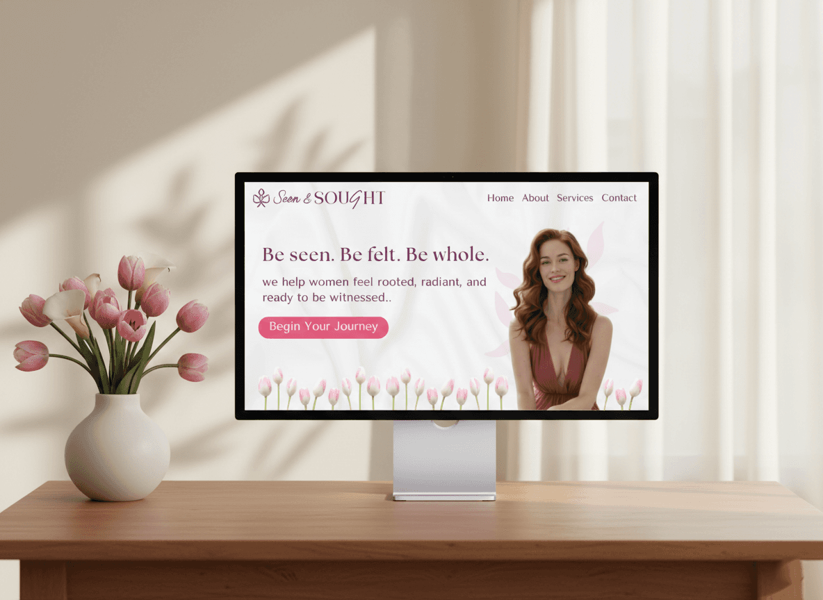
Seen & Sought is built to reimagine what confidence and visibility look like for women.
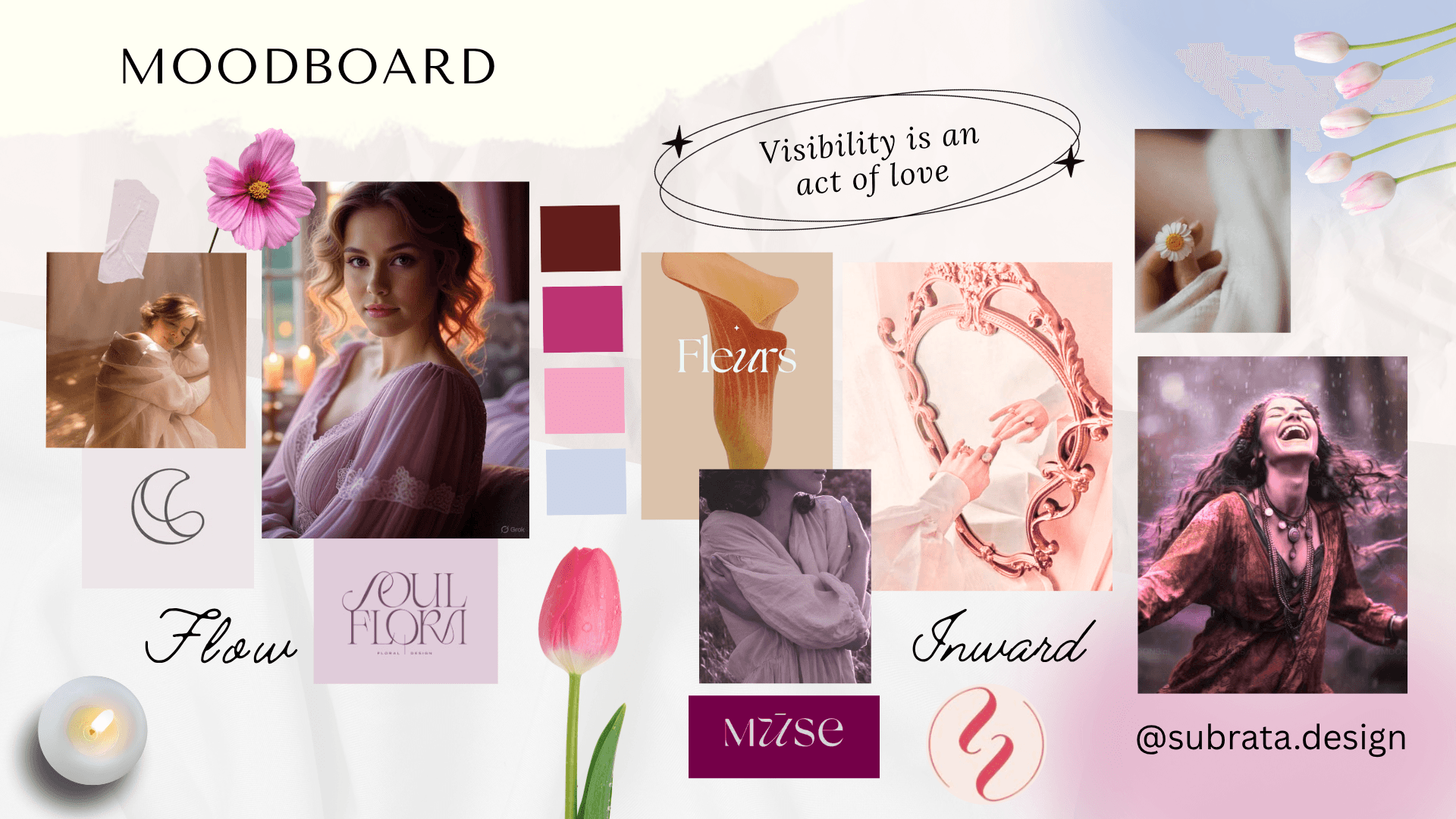
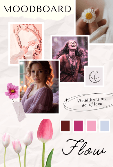
In a space where confidence is often framed as being louder, harder, or constantly pushing forward, this brand chooses a different path. One rooted in softness, authenticity, and self-trust.
We believe real confidence grows through consistent inner work, self-love, and the courage to set healthy boundaries. Through presence rather than performance. Through being with oneself, not forcing oneself to be more.
Seen & Sought exists to make that way of becoming visible feel safe, beautiful, and sustainable.
The goal was to create a brand that stands apart in the confidence and visibility coaching space - not by being bolder, but by being more intentional.
Visually and emotionally, the brand needed to:
Capture softness without fragility
Express femininity without cliché
Communicate confidence without force
Feel calm, grounded, and deeply human
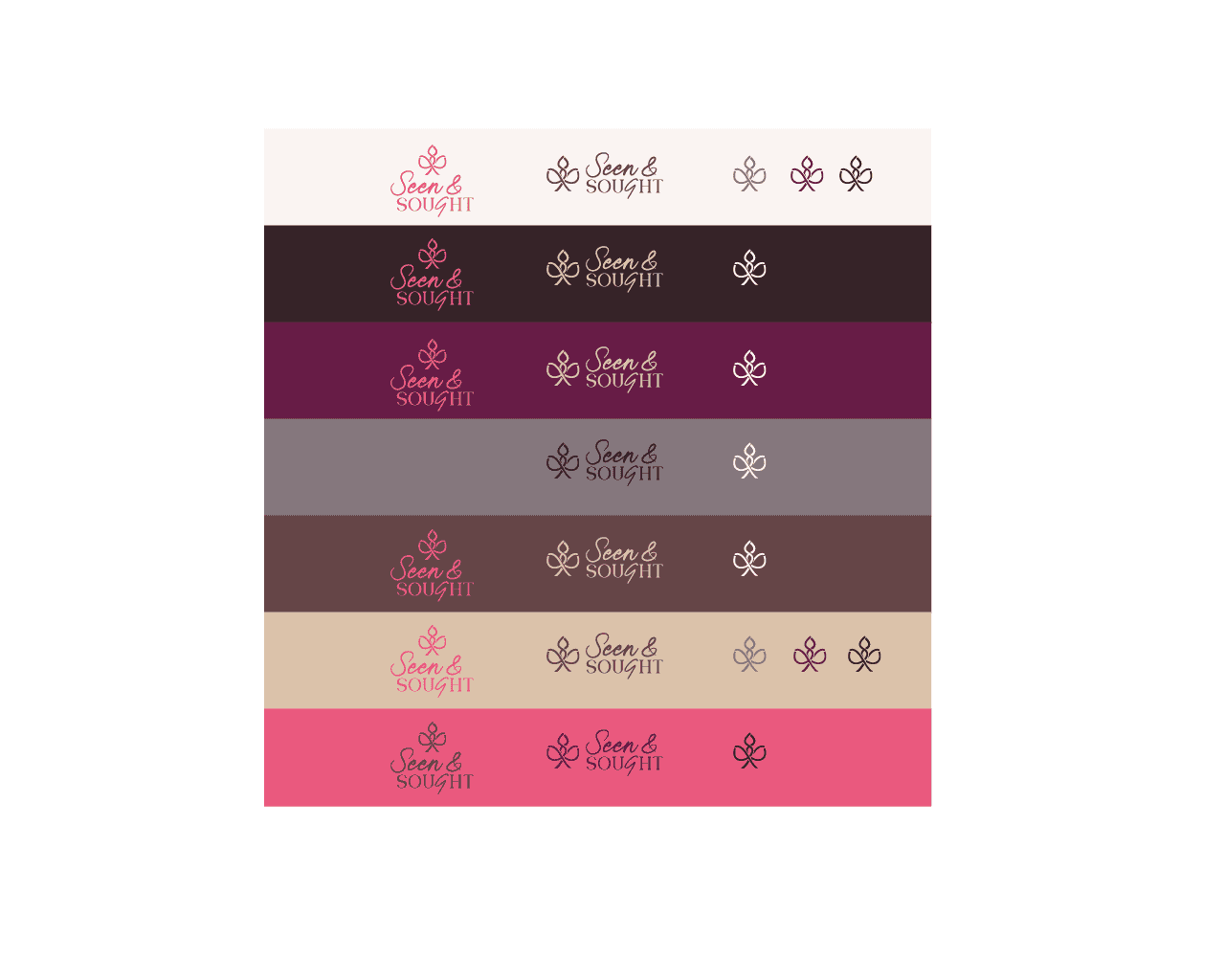
The identity was designed to reflect the brand’s essence - a quiet strength, a sense of self-regard, and a gentle but unwavering presence - creating a visual system that feels both distinctive and deeply aligned.

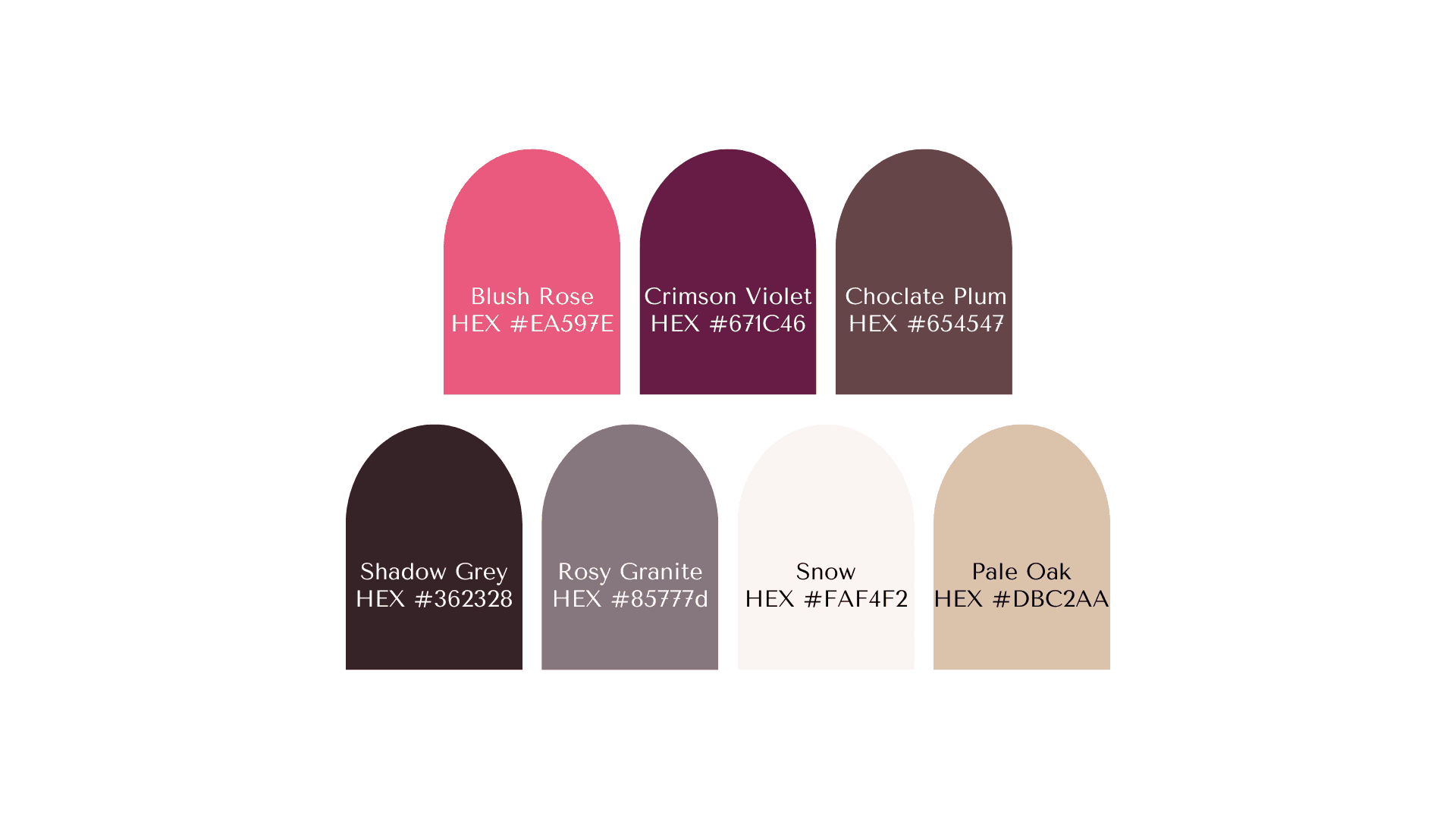
The Seen & Sought logo was designed as a symbol of gentle visibility and inner wholeness.
At the heart of the mark is a tulip-inspired form, representing becoming, softness, and feminine presence. The tulip is not fully open nor tightly closed - it exists in a state of unfolding, mirroring the brand’s belief that confidence grows gradually through inner work and self-regard.
The structure of the symbol carries subtle symmetry, evoking the idea of a mirror - a visual metaphor for self-reflection and being seen from within before seeking external validation. This balance reflects the brand’s philosophy of visibility without self-betrayal.